Dainty Jewell's

Project Description
eCommerce Website Redesign for Apparel Company Dainty Jewell's
Founded by Charity Walter, Dainty Jewell’s was one of the first on the market to offer modest fashion apparel that women can feel comfortable and stylish in. With a range of dresses, swimsuits, girls' clothing, and even bridal clothing, the clothier has garnered quite a following of women and girls who have been seeking out a market like this.
Project Objectives
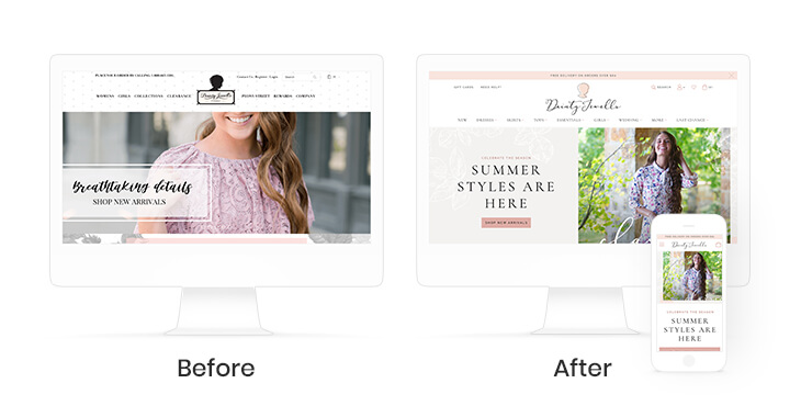
The previous website did not offer the functionality desired by the Dainty Jewell’s team, nor did it portray the branding they desired. From custom pages to photo galleries, to mobile-first design, the website had a lot of potential to truly delight their customers as much as their clothes do.
Logo & Tag Design
After discussing the initial website design, it was clear that the current logo didn’t reflect where Charity envisioned the brand going, so we recommended a refresh. With the refresh, we wanted to keep the silhouette look and feel, but modernize it and clean it up. We found a script font that was more modern and feminine and designed the highlighted silhouette as a nod to the old design that also reflects a modern look.
From there we wanted to reflect this new branding and create hangtags that are attached to all the dresses. We updated the logo and design on the hang tags to match the new fashion-forward yet feminine style.
Website Design
With beautiful dress designs and fantastic product imagery, it was easy to be inspired to design the new site. We wanted to overall modernize the look and feel of the site while maintaining tones of elegance, class, and femininity. We first created a longer scrolling homepage that highlighted different aspects of the brand and what differentiated them, as well as made it easy for users to jump off to different parts of the site.
In terms of navigation, we worked to streamline the user experience to make it easier for customers to find what they’re looking for, learn about the brand, and easily purchase products. We broke out the menu into the different types of products they offer so that new and returning users could both find the exact type of product they were looking for.
Throughout the site, you’ll find feminine touches that accent the beautiful clothing and share the personality of the Dainty Jewell’s brand.

Headless Commerce
The site was previously on the Blueprint version of BigCommerce and needed updating to the Stencil theme for optimal functionality. With that update, we paired BigCommerce with FusionCMS to allow for a powerful eCommerce engine and the ability to customize the design to match the brand.
With an extremely popular and high trafficked blog that wasn’t previously tied to the store, we wanted to combine the two for SEO benefits and streamlined user experience. In terms of SEO, the traffic would benefit the organic rankings of the store, allowing more users to find it through organic search terms. In terms of user experience, keeping the blog and the store on the same platform allows shoppers and blog readers alike to get more out of their experience and explore more about the Dainty Jewell’s brand.
Custom Pages
With the use of headless commerce, we were able to create a number of custom pages including “Lookbooks” for new seasonal lines, as well as expand on their bridal section. Charity and her team have a passion for working with brides, so we wanted to create custom-designed subpages and landing pages that would share photos and testimonials about bridal packages through Dainty Jewell’s.


